While someone may choose their logo colors based on personal favorites, it's not necessarily the best practice. Logo design colors should be chosen based on how appropriately they fit with your business mission, personality, and clientele. Your color palette should help to convey your business message -- your logo colors should work for you.
But how do you decide which colors do just that? To find out the answer, we have to go through several steps that break down the color choosing process.
1) Choose two to three main colors. Many people assume that they should incorporate every color that they want in their marketing materials into their logo as well. This is not the case. First, choose two to three main colors that fit with your business personality and stick with those. Having several colors in your logo design can sometimes look a little excessive. Incorporate the other colors into your business cards, brochures, flyers, etc.
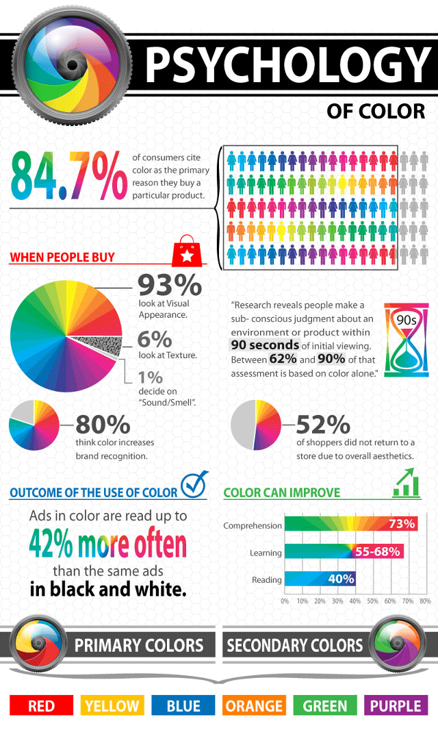
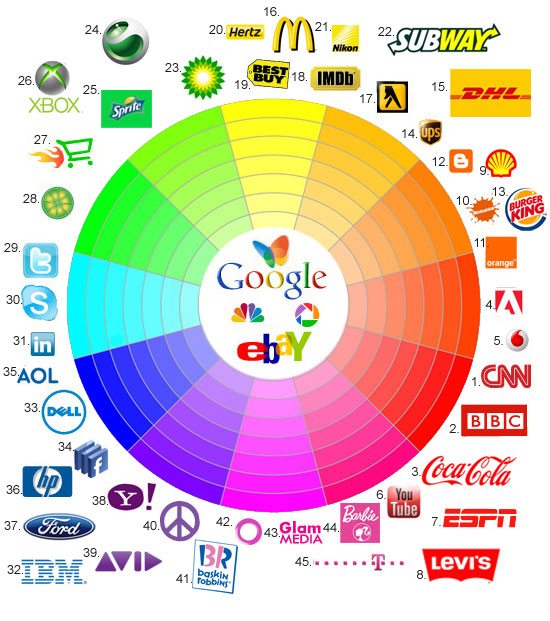
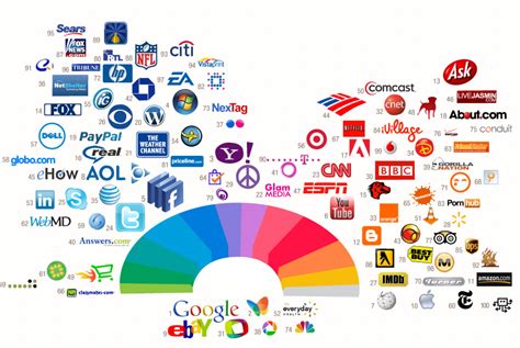
2) Use color psychology to pick your main colors. One of the most compelling means of non-verbal communication is that of color. Upon one glance, color can convey a message or meaning. Certain colors can make us feel warm and happy, while others may bring on sadness and fear. For instance, the color green represents renewed life and freshness. But it can also portray money and jealousy. It would be an ideal choice for a "green" or eco-friendly business as well as a landscaping company. Be sure to implement this strategy in your logo, so that it will communicate the right feelings to your customers.
3) Make sure your logo has contrasting colors. This will give your logo design depth and help it to be more eye catching. It will also help when it has to be printed in black and white or in grayscale.
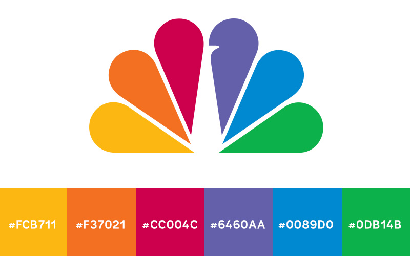
4) Choose colors that complement each other. If you've chosen your colors based on color psychology or contrasting colors alone, they might not harmonize together well. Put your color choices next to each other to make sure it looks visually appealing and corresponds well. Also, some colors look different when next to different shades. Compare swatches and find the perfect shades for your brand.
By going through the above steps and comparing them with the different meanings in color psychology, you should be able to have a clear image in mind of what colors will work best with your brand. If you're having a hard time narrowing your color palette down, consider speaking with a professional logo designer. Not only do they have an "eye" for picking colors that go well, but they also have a knowledge of what colors work best for specific industries.
At the end of the day, you want your logo design to work for you by sticking in the minds of customers and telling your brand story. Choosing the right color palette plays a pivotal role in that process. Your logo and its colors need to work for you, and certainly will if you apply the above steps.


No comments:
Post a Comment